87 Features in 10 Months
After a year full of learning and coding adventures, my time at Bending Spoons has come to an end as I pursue a different venture. Thanks to its extremely dynamic and autonomous culture, in the last 10 months (been here for 12, but the first 2 were training), I have built and shipped 87 features completely independently. This has amounted to a total of, drum roll, 214 PRs!
I want to use this article as an opportunity to reflect on the lessons learned in the past year, and my experiences as a developer. It is also a bit of a feature dump, more for myself than anything, with the highlights of things I’ve built and feel proud of. I obviously won’t include any features already mentioned in other articles, and bear in mind that not all features are extremely impactful, or even user facing. But I can proudly go having built at least 25 very impactful and well-received features under my built, which alone would be impressive to me in just 10 months :D
A Year at Bending Spoons
I don’t think I surprise anyone when I say Bending Spoons is a demanding company. It is competitive to get into, and they expect high quality and effort in return. It is also likely the best initial formal software engineering role I could have asked for.
I have briefly mentioned this before, but what made this opportunity ripe for fast learning was the amount of agency and responsibility that Bending gives to it’s developers. Regular releases to production teach you accountability, and they also encourage you to get involved in more than just the coding (and PR reviews), such as suggesting metrics, analyzing data, coming up with product features, designing UI/UX where needed, and the list goes on.
One thing that was striking to me from the beginning is the company structure - when I joined, we were still an SME (as we had ~400 workers), and it has since crossed the bar to corporation (and surpassed the $1B ARR milestone). But even now, it still operates as a collection of small startups, each with its own small but well-oiled team, which bring true meaning to being 10x engineers, when statistically comparing number of workers running the product pre and post acquisition.
Between these teams, there is very open communication, and we are encouraged to share learnings with each other when things work so all products can reap the benefits. Examples of this are the Google One Tap implementation, recommended to us in StreamYard from a colleagues learnings and after WeTransfer also implemented it. And likewise, I then walked other colleagues across another team through the implementation. Another example was testing the Figma MCP, which was something I was tasked to do, to then produce a report and share it in a public internal channel (spoiler alert: we didn’t end up using the Figma MCP much).
Something else I learned and was super valuable is the structure of these small teams. In my experience, 3 members was the perfect size for an engineering team. After this, meetings ran too long (and we had too many), we ran into each other when picking up new tasks, and PR review cycles got messy. So while the actual team for the product may indeed be bigger, it is subdivided into tiny teams with very clearly defined scopes, as is the case of User Acquisition or Quality of Experience, 2 of the teams I was in.
Also, there is the question of how to best allocate resources. I already find myself thinking back to Bending when reasoning about this problem. One thing they have really figured out is training - I have mentioned this before, but the encourage engineers to become T-shaped (deep knowledge in specialized area but enough knowledge across whole product that could land changes if needed). As such, the training is 2 months and makes you build an end to end software product.
I can imagine I will use this principle in the future, especially in startups. When building a new product, it is critical in my opinion that, if you have a small team, everyone has enough context around the different components of the product, and they rotate the work to at least work on other parts from time to time to stay sharp.
The Dawn of AI
Also an interesting change this year was the mass adoption of coding agents such as Claude Code. Of course others AI tools existed already, such as the autocomplete or Cursor. But nothing has changed the way we as developers work as much as agentic development.
While they can achieve incredible feats, it is almost sad, because these tools used to save me time, help me work effectively, and still required a lot of actual thinking on my part. But as the industry starts widely adopting them, the expectation has become higher and now we are just expected to release more. While at Bending they remained very conscious of code quality and still respected proper review cycles, I can only imagine not all companies will follow this ideology, and many will fail.
The Right Aside Side Tab Animation
I am a big fan of relatively small changes that modernize the product and make it aesthetically pleasing. This small feature scratches my brain each time I see it:
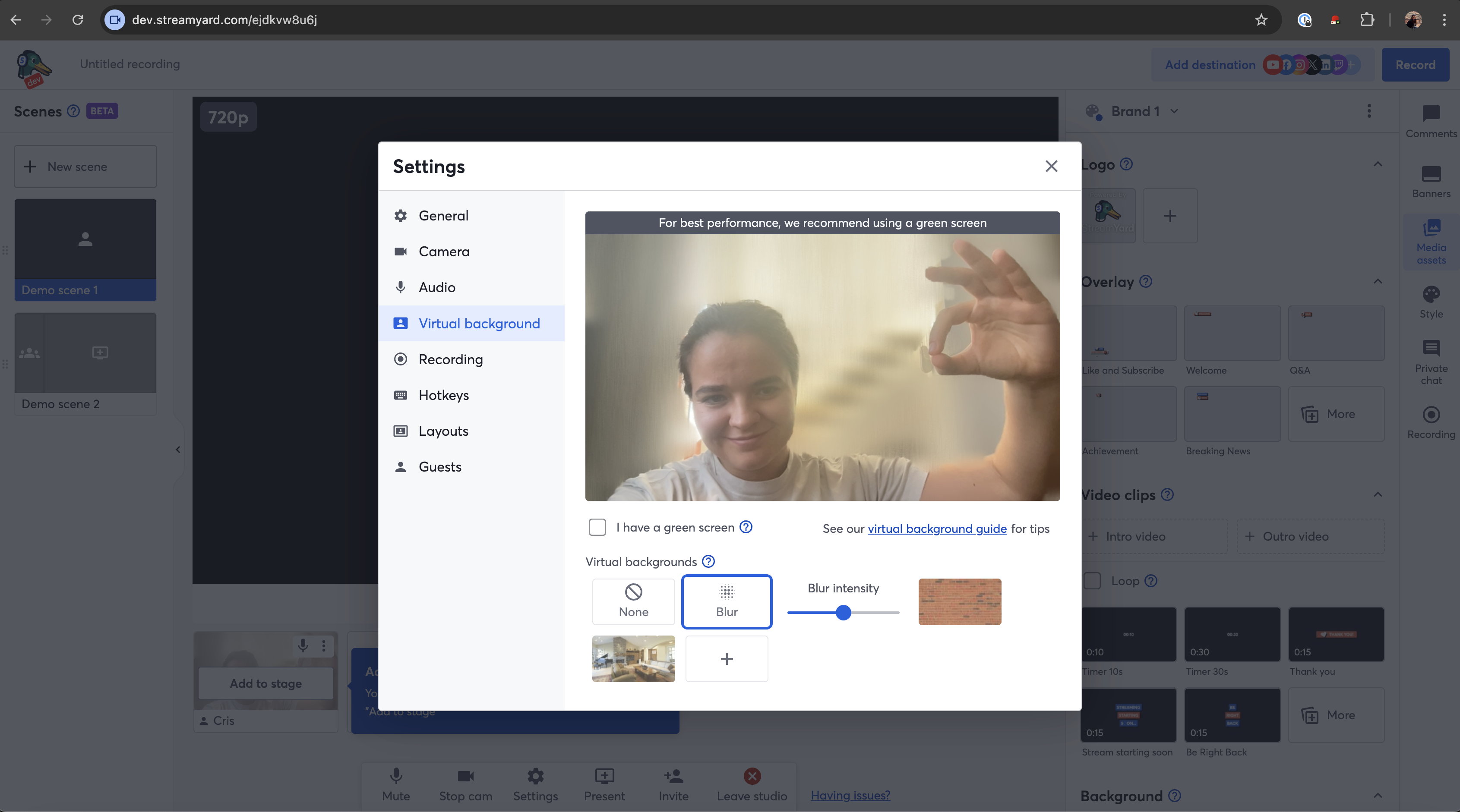
Blur Intensity Slider
Before, StreamYard only offered one setting for blurring your background, and it was waaaay too intense, it looked horrible. I realized this while using the product on a weekend while helping some friends out with something, and had a lightbulb moment where I realized “hey, I’m a StreamYard dev, if I don’t like it I can change it”. So I added a slider to adjust the intensity of the blur.
It was not trivial since this meant changes to the UI and backend as I needed to ensure the background changes propagate to the video that is recorded. But arriving the next week with a new feature, and the happiness of my colleagues, made it super worth it.
And the polished UI:
You fell for it.
More Custom Layouts
This was a fun feature - I was tasked with increasing the custom layout limit from 8 to 16 only for paid users, as well as adding the new settings entry point button in the row, next to the add and edit buttons. I got to touch some backend and a lot of frontend. One of the things to bear in mind was downgrade - if a user created more than 8 custom layouts while subscribed, and then they cancelled their membership, the layouts should be greyed out, and upon click show an upgrade modal.
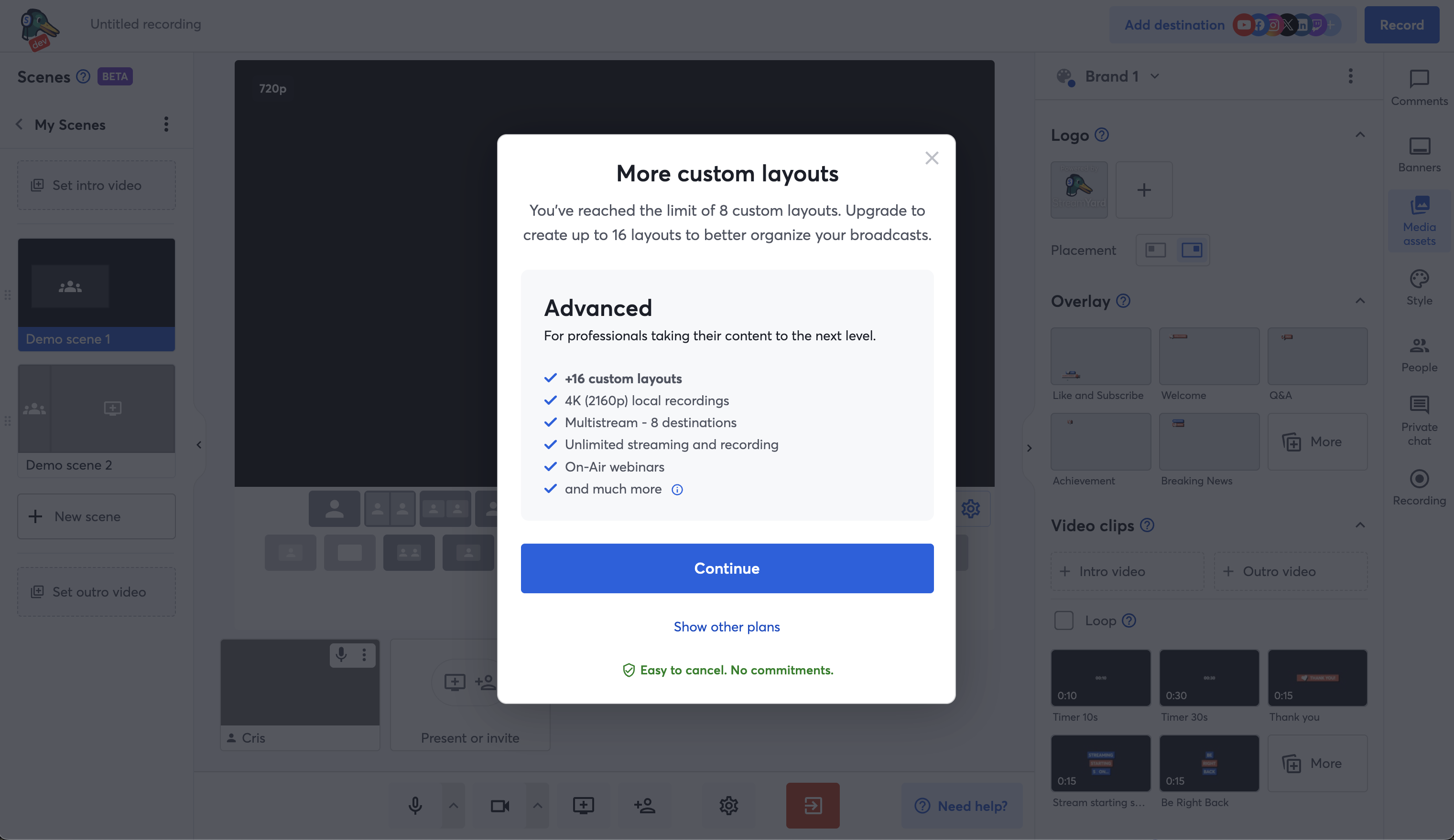
Also it was hard because given the increased amount of layouts, I had to consider how to show this for portrait and mobile, and test a lot (because that component is declared stupidly).
Then, I had some time and improved the animation to show and hide the extra layouts, which before was just a blink.
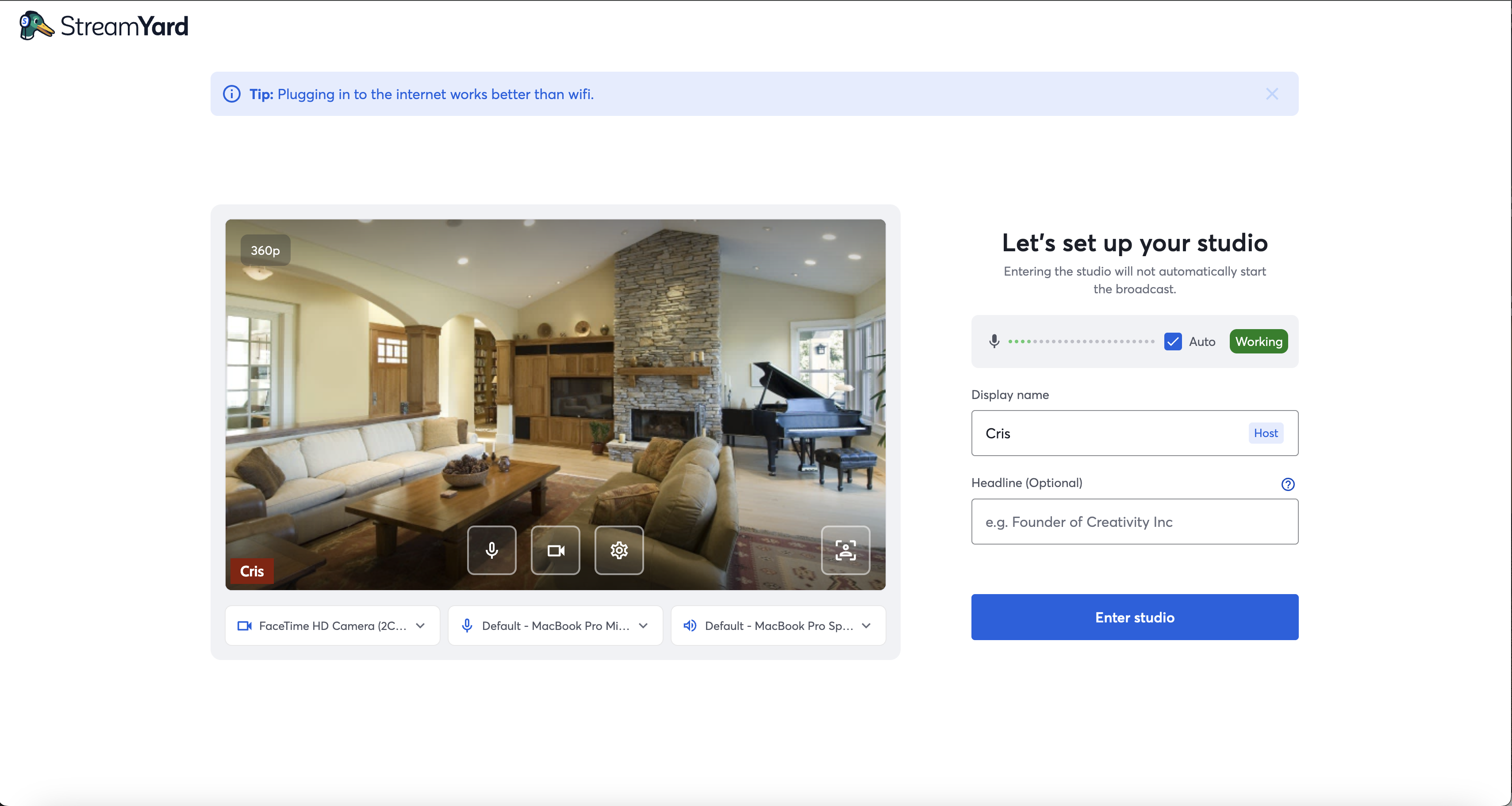
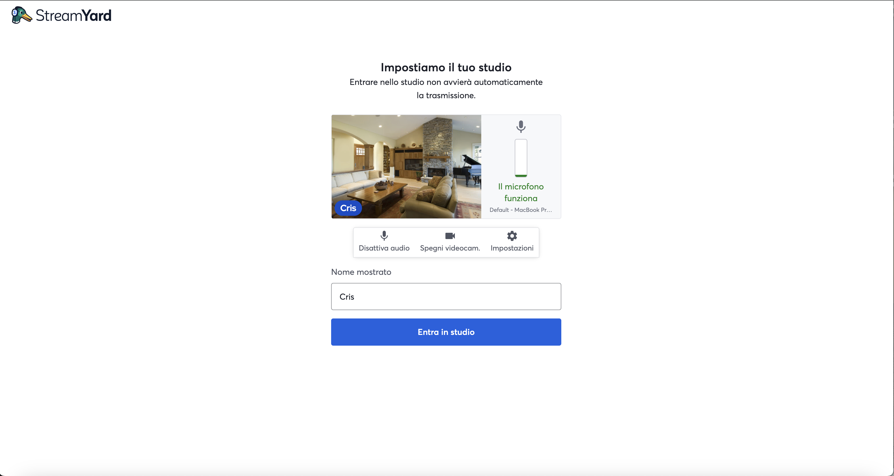
Entrance Revamp
I worked on creating 2 new versions of the entrance studio, one wth the 3 controls and the other without, to test whether this affected the number of users actually going into a studio. It also looks better than the usual one.
vs the default:
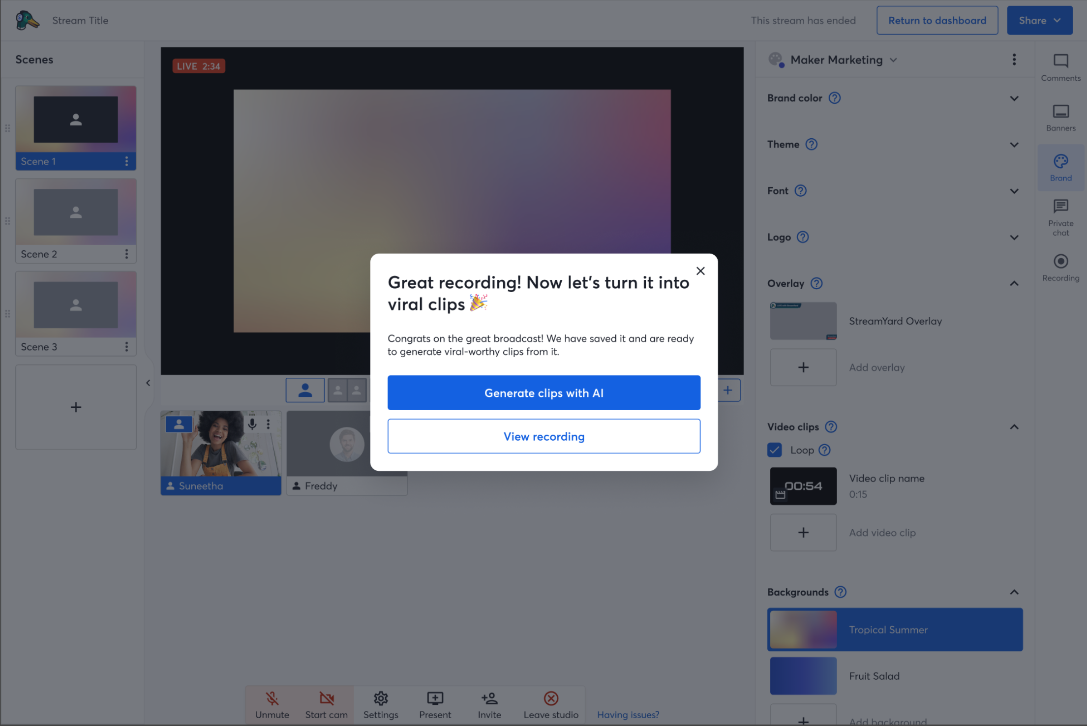
AI Clips Modal After Stream
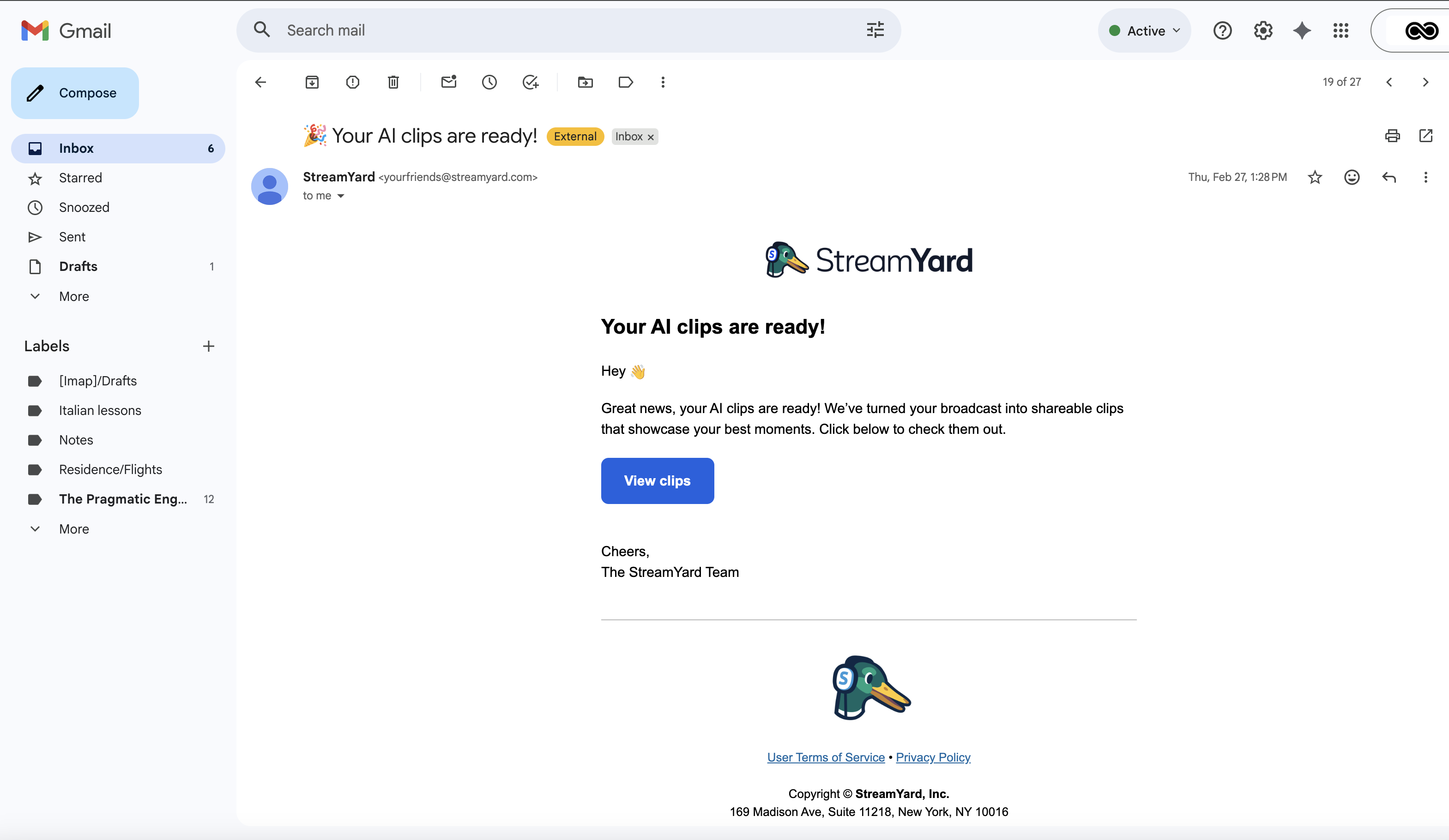
This was actually my first task in the Product squad (my second squad). The goal was to add a modal when users finished a broadcast to raise awareness about the AI Clip generation feature - you get the highlights of your broadcast as short, shareable videos in portrait mode and with captions, kind of what you see on Instagram and TikTok all the time. Then with a few clicks, you can directly share them on your platforms.
There were 2 main issues: first, AI clip generation only works for videos of lengths between 30 seconds and 2 hours, as this is what the backend model takes as input. However, it was not easy to calculate the length of a reusable studio broadcast, and they work with episodes whose lengths are cumulative from the first one. So for pragmatism, I reported this back and we decided to ignore that case for now as it impacted few of our target users.
Second, for AI clip generation the video must first have been processed, meaning that upon finishing a broadcast we must first wait for it to upload to the cloud, and then we can begin generating. Since this can take a while, and there was no proper backend handling of messages to know when processing had finished in that part of the app, I had to come up with a clever workaround under the time constraint. I figured that since upon closing the tab, any hooks would unmount and so we couldn’t use a simple useEffect, I would instead open a second tab, which showed a modal saying “video processing, please don’t close this tab” first, and upon completion showed “AI clips are generating, you can now leave this page”. Since we had been super close to having to scratch the task altogether, my teammates were happy to at least be able to finish and ship it on time, even if it was suboptimal, and this was my first taste of just how much agency I can exercise as a Bending Spoons dev. And side note, since then, we have added the proper message handling to no longer need this!
And if you clicked on “View your recording”, it would directly take you to the Library to that specific recording.
This task was also cool because I had to learn how to use several email notification systems to send emails to users once the AI clip generation had finished, by emitting an event and setting up a pipeline, and designing the email.
Referral Countdown
In an attempt to make referred users more aware of their available credits, I added a referral banner, with 2 versions, a simple one (just the banner), and an aggressive one (with a countdown).
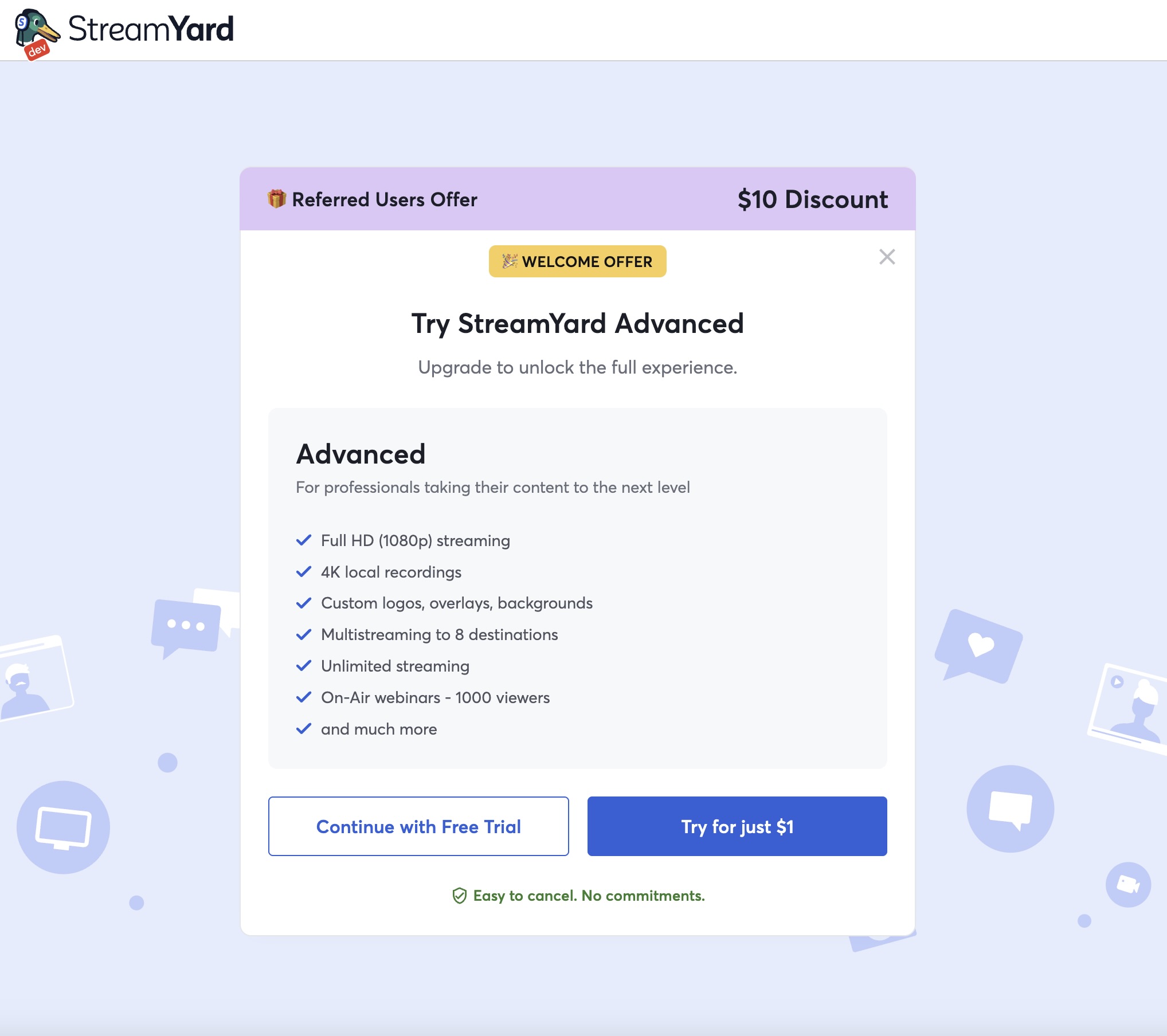
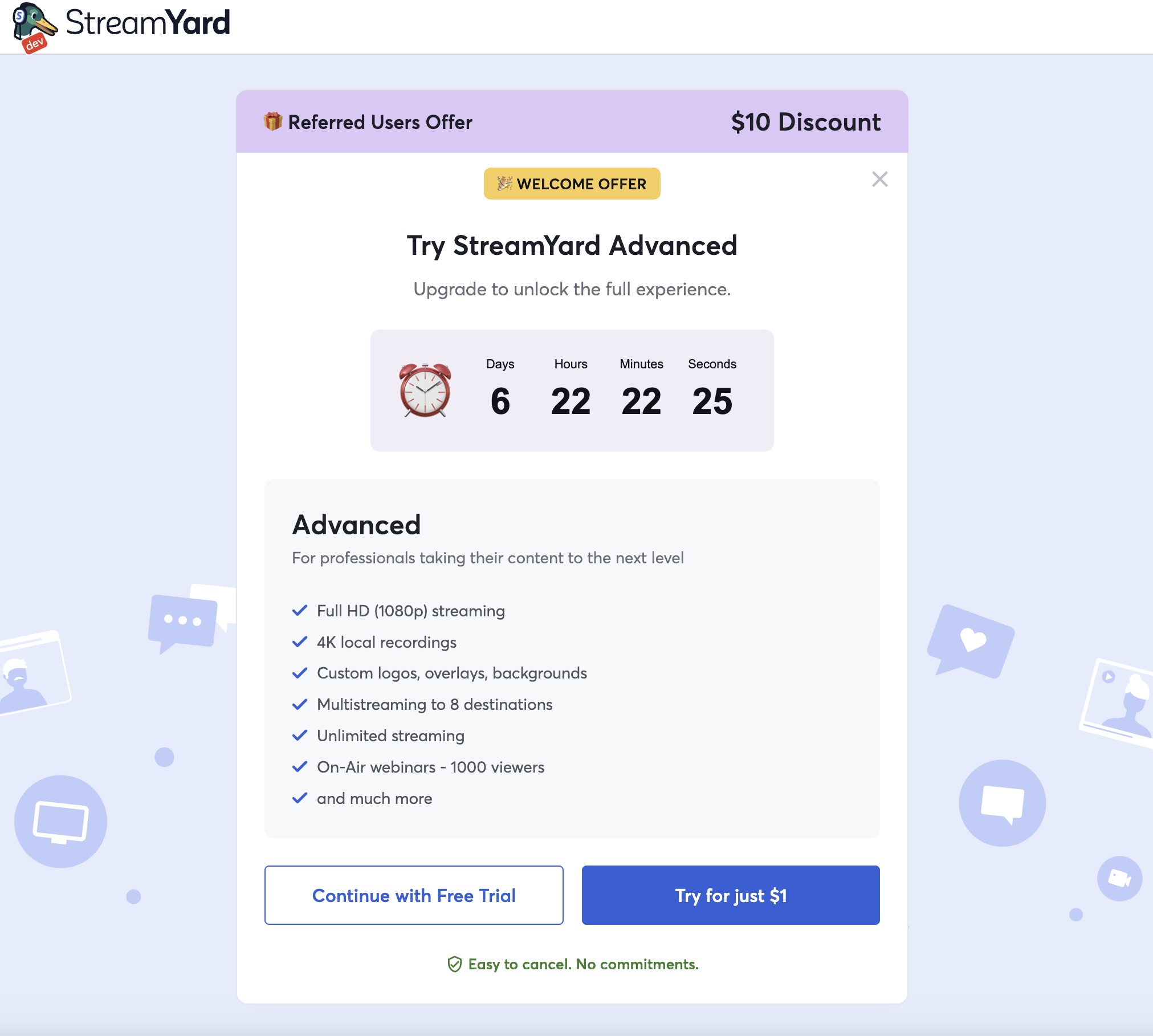
But users really didn’t like the aggressive variant and we quickly had to close that down as it affected metrics negatively.
Banner to Return to Dashboard in Mobile
This one really is simple. But before on mobile, we had no way for users to return to the dashboard once in the studio. So I just added the banner with the SY logo as we have in desktop.
New Guest in Studio Pop Up
As some users had asked for a better way to manage when guests enter the studio, ideally a shortcut to add them on stage, I was tasked with adding just this.
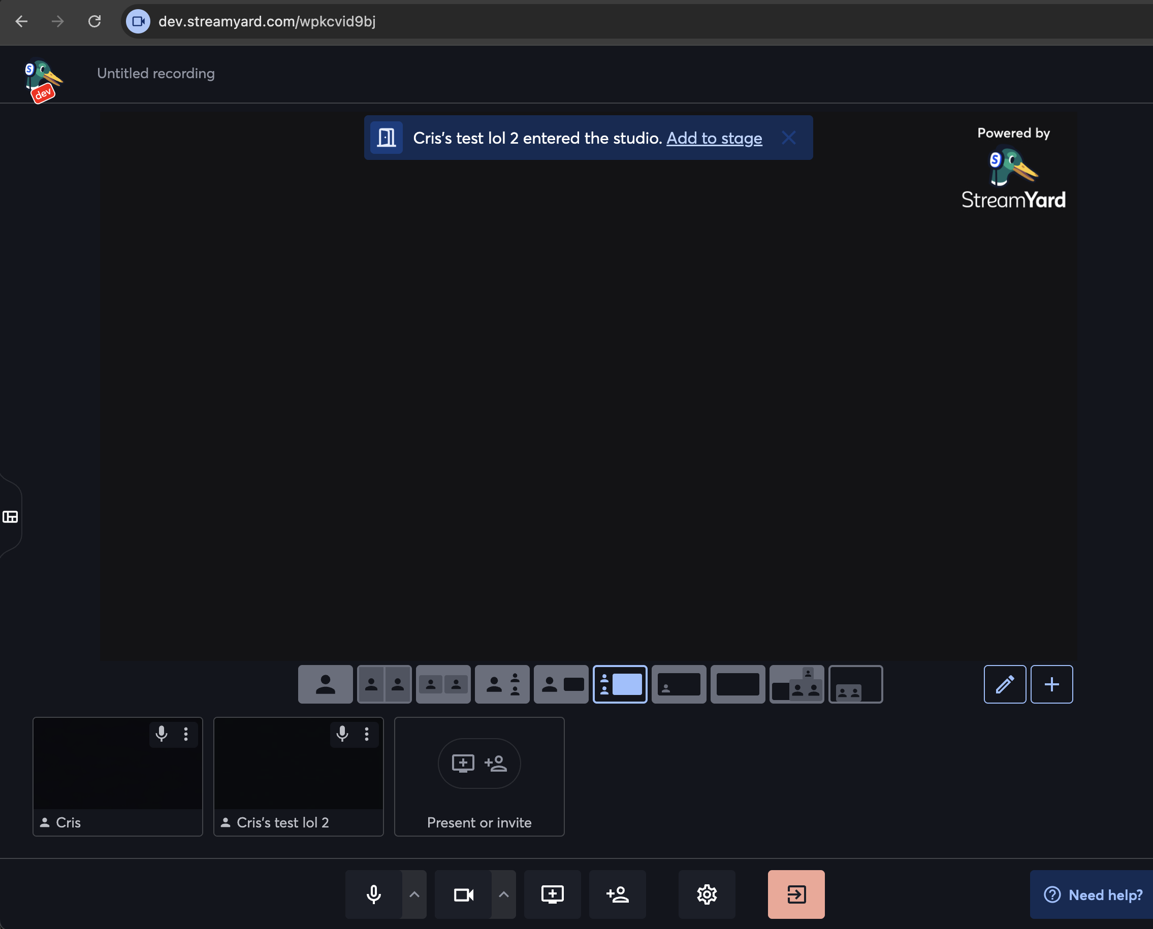
Upon clicking this, it directly adds the user to stage, or it disappears after a few seconds if not clicked. It also handles the green room case to instead display “Add to studio”.
Since I was touching the alert banners, I then also revamped the “mic is muted” one:
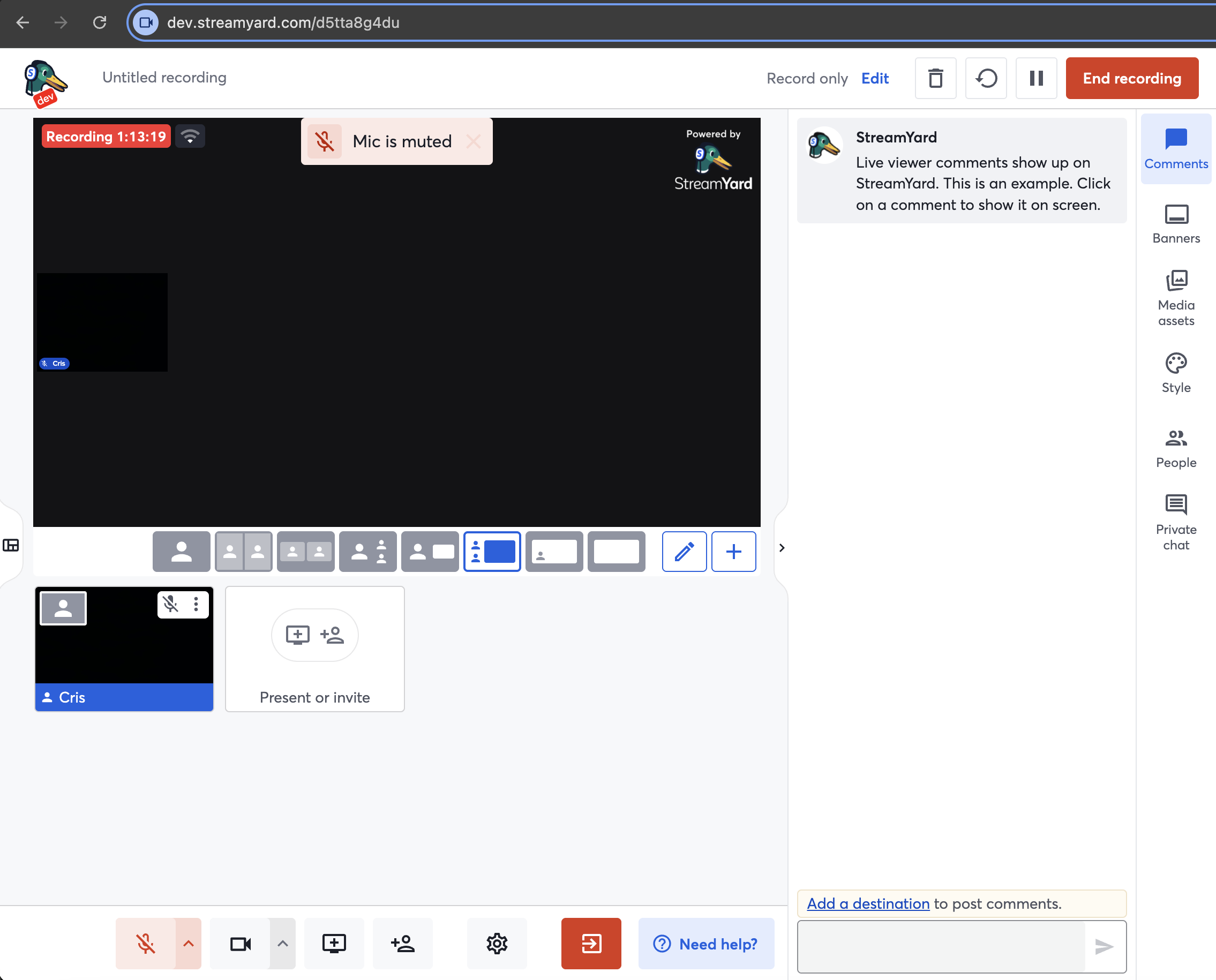
And added settings to be able to disable these alerts altogether if they were dirsuptive to the user, and to hide the resolution tag.
Also added some very minor UI changes to revamp the stage: border radius to the stage, some top margin, changed the opacity of the resolution tag, and moved the “Enhance my appearance” setting to the tab I renamed “Visual Effects” as it was not clear before.
Split Live and Recording
The default experience in StreamYard is that if you are in a recording studio but add a destination, you switch to a live stream studio, and vice versa if you delete your destinations. The types of studios are separate entities. We wanted to see if we could simplify the codebase by splitting these further so you can never switch between them. This task was very technically difficult and included a bunch of architecture and UI changes. In the end, metrics were slightly impacted negatively and we decided to keep the default experience.
Others
Other non-user-facing features include codebase cleanups, mainly of feature flags but also of support to competing platforms, revamping the feedback modal and refactoring our internal messaging system for video updates to use Zod instead of Joi for schemas and validations for better type inference. I also added a bunch of missing metrics.